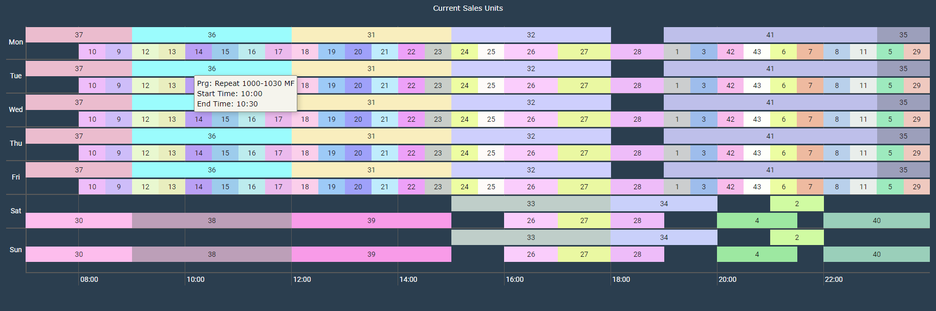
- The graph shows sales units which are currently in the application for the selected channel
- The x-axis shows time of the day
- The y-axis shows the day of the week
- The idea is to know the overlapping pattern of the sales units
- The graph helps in understanding the overlapping pattern of the sales units.
- Two or more sales units at the the same time range are shown using stacked bars.
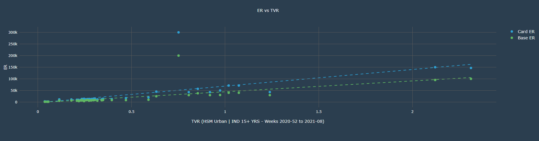
- The graph shows TVR and ER(card and base) of the sales units
- The x-axis shows the TVR of the sales unit
- The y-axis shows the ER value of the sales unit
- The trend line shows how the ER are being distributed among the sales units, which helps in deciding the right ER for the sales unit for a given TVR.