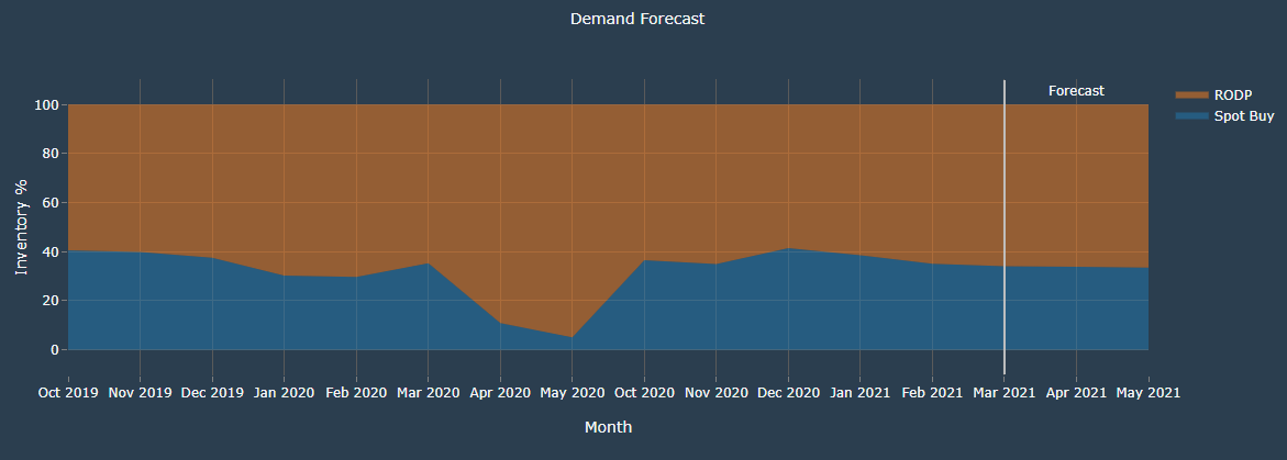
- The graph shows forecast of the demand for upcoming months
- The x-axis shows the months
- The y-axis shows the inventory usage(in percentage)
- The graph helps to understand the trend in the inventory usage over the past months and make appropriate forecast for the future.
- The white line(annotated as forecast) seperates the forecast values from the historic values.