Inventory Visualitions
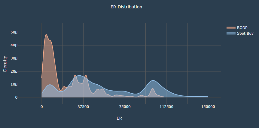
- The graph shows the distribution of the ER values in terms of density of selected category
- The x-axis shows the range of ER values
- The y-axis shows the density of the corresponding ER value.
- The idea is, a peak at a certain ER value implies that the usage at that ER value and its surroundings is higher
- The graph shows the trend of the ER at the given inputs as well as comparison with the alternate category.
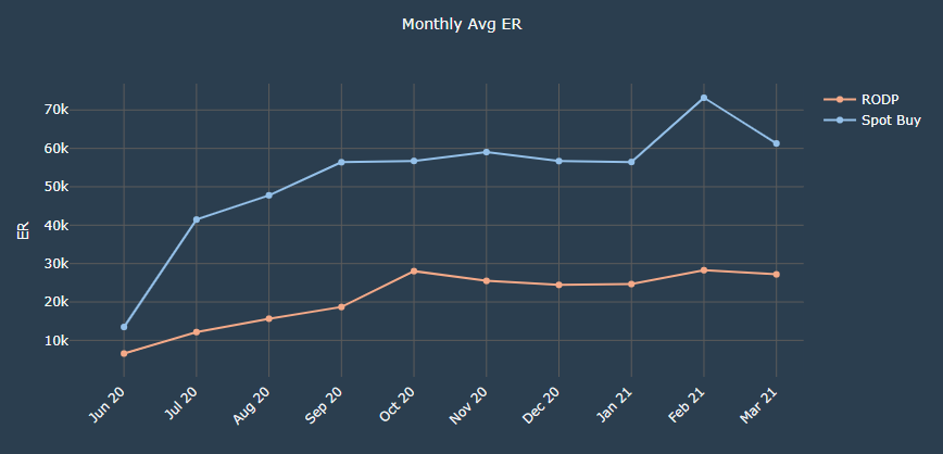
- The graph shows the monthly average values of ER for selected category
- The x-axis shows the months of the selected range
- The y-axis shows the range of ER values
- The idea is to know the average ER maintained for the particular month and compare the average values of ER with the alternate category
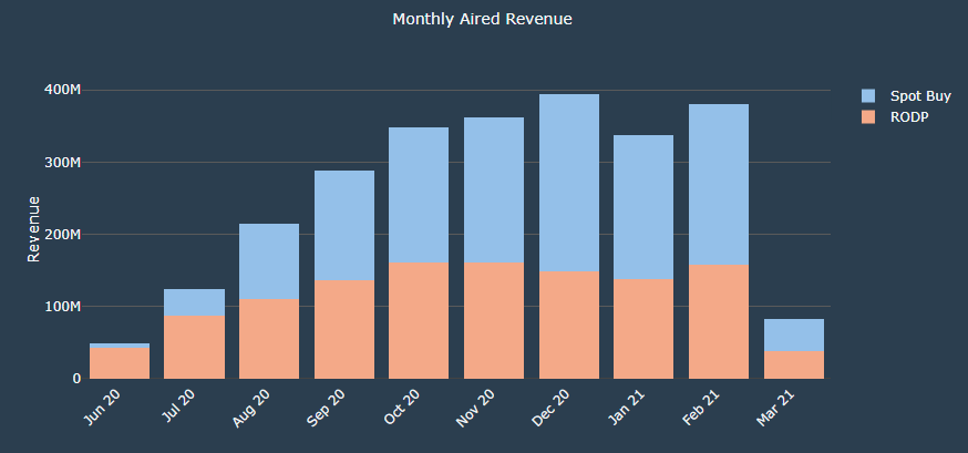
- The graph shows the monthly revenue generated for selected category(stacked)
- The x-axis shows the months of the selected range
- The y-axis shows the range of the revenue
- The bars show the revenue generated for the particular month and compare the revenue with the alternate category
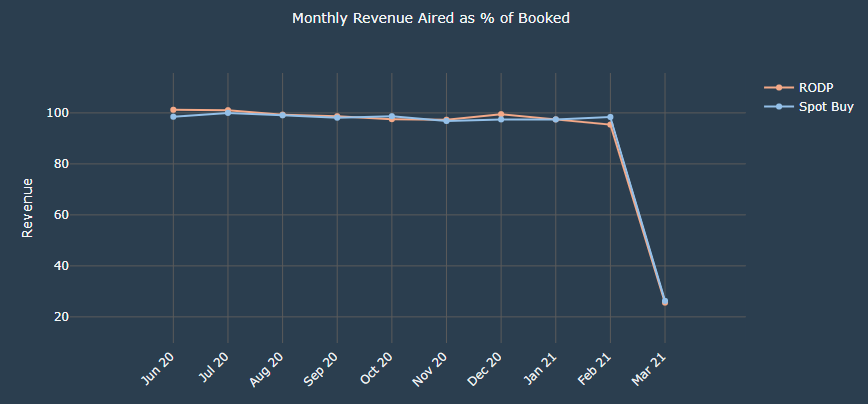
- The graph shows the monthly revenue generated as percentage of aired out of booked for selected category
- The x-axis shows the months of the selected range
- The y-axis shows the range of the revenue(in percentage)
- The lines show the percentage of booking converted to aired for the particular month and compare it with the alternate category
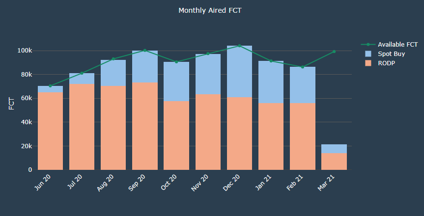
- The graph shows the monthly FCT available(Avaliable FCT Line) as well as telecasted for selected category(stacked)
- The x-axis shows the months of the selected range
- The y-axis shows the range of the FCT values
- The bars show the FCT aired compared with the availabe FCT for the particular month.
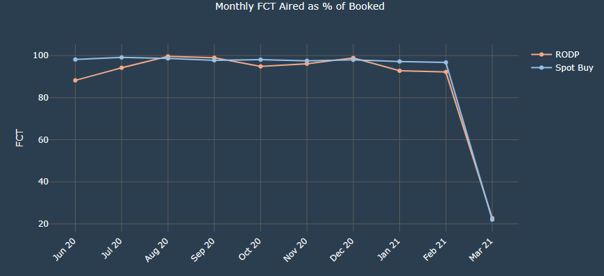
- The graph shows the monthly FCT used as percentage of aired out of booked for selected category
- The x-axis shows the months of the selected range
- The y-axis shows the range of the FCT values(in percentage)
- The lines show the percentage of booking converting to aired for the particular month and compare it with the alternate category
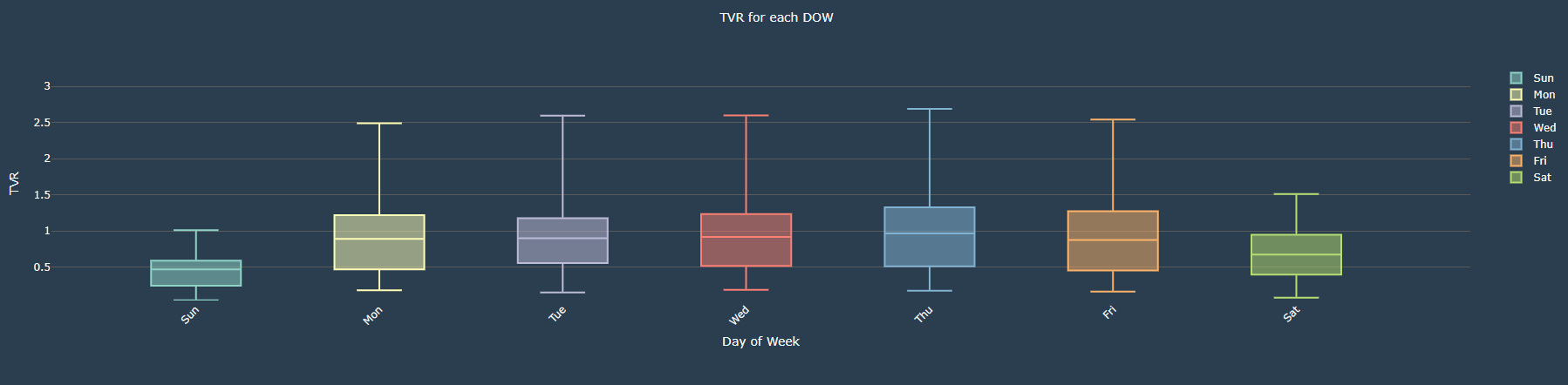
- The graph shows the TVR box plot for each day of the week
- The x-axis shows the day of the week
- The y-axis shows the range of the TVR
- The plot shows the TVR distribution over the period of time. The graph illustrates the minimum, first quartile, median, third quartile, and maximum of the TVR
- It helps to create different combination of SKU for the given days