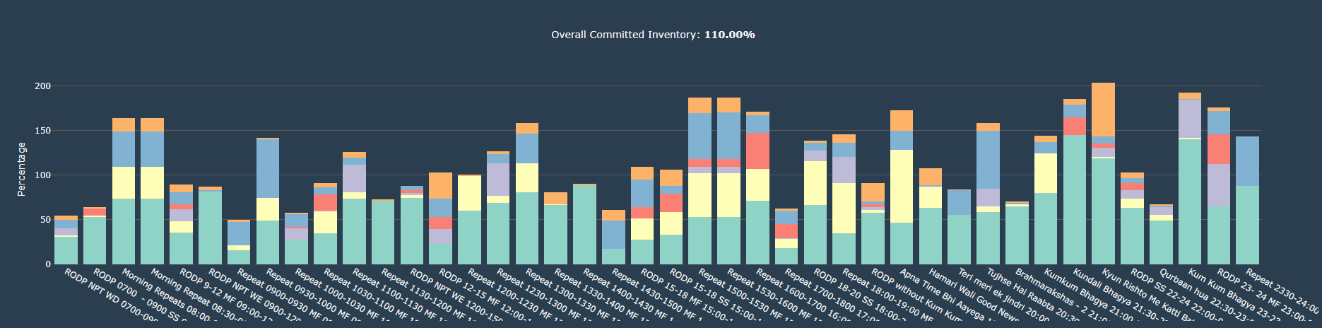
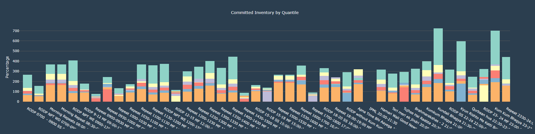
- The graph shows the monthly committed inventory for each sales unit
- The x-axis shows different sales unit available
- The y-axis shows the percentage of committed inventory
- For each sales unit we have show percentage at various quantile wiz. 0.2, 0.4, 0.5, 0.6, 0.8, 1
- So, we could compare the distibution of committed fct over the total fct for the respective sales unit
- The graph shows the TVR box plot for each day of the week
- The x-axis shows the day of the week
- The y-axis shows the range of the TVR
- The plot shows the TVR distribution over the period of time. The graph illustrates the minimum, first quartile, median, third quartile, and maximum of the TVR
- It helps to create different combination of SKU for the given days
| Program Name | Start Time | End Time | DOW | Probs | Committed Inventory |
|---|---|---|---|---|---|
| Apna Time Bhi Aayega 19:00-19:30 | 19:00 | 19:30 | M T W T F S S | 0.20 | 3,384 |
| Apna Time Bhi Aayega 19:00-19:30 | 19:00 | 19:30 | M T W T F S S | 0.40 | 9,230 |
| Apna Time Bhi Aayega 19:00-19:30 | 19:00 | 19:30 | M T W T F S S | 0.50 | 9,230 |
| Apna Time Bhi Aayega 19:00-19:30 | 19:00 | 19:30 | M T W T F S S | 0.60 | 9,230 |
| Apna Time Bhi Aayega 19:00-19:30 | 19:00 | 19:30 | M T W T F S S | 0.80 | 10,771 |
| Apna Time Bhi Aayega 19:00-19:30 | 19:00 | 19:30 | M T W T F S S | 1.00 | 12,430 |
| Brahmarakshas - 2 21:00-22:00 | 21:00 | 22:00 | M T W T F S S | 0.20 | 3,755 |
| Brahmarakshas - 2 21:00-22:00 | 21:00 | 22:00 | M T W T F S S | 0.40 | 3,887 |
| Brahmarakshas - 2 21:00-22:00 | 21:00 | 22:00 | M T W T F S S | 0.50 | 3,887 |